In Part 1, we have managed to implement the show and hide card animation when user tap on button or the dimmer view. In this part, we are going to implement the card dragging animation. This post assume that you already knew about Auto Layout and Delegate.
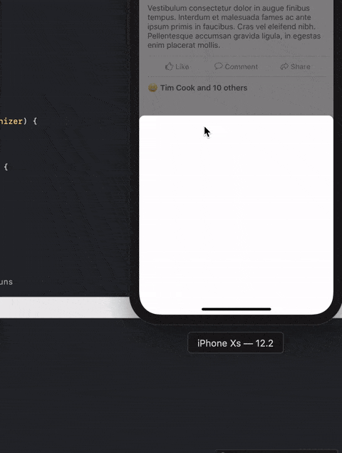
In this post we are going to implement this :
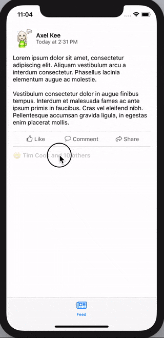
Continuing from previous progress, so far we have implemented the function showCard() and hideCardAndGoBack() like this :
Before we jump into implementing the card dragging animation, remember that there is two state for the card, .normal and .expanded ?
We will create an enum for the card state and a variable to store the card state, so we can know whats the current card state and perform different animation depending on the current state (eg: an expanded card cannot be further expanded).
// ReactionViewController.swift

class ReactionViewController: UIViewController {

  // IBOutlet here ...

  enum CardViewState {
      case expanded
      case normal
  }

  // default card view state is normal
  var cardViewState : CardViewState = .normal

  // to store the card view top constraint value before the dragging start
  // default is 30 pt from safe area top
  var cardPanStartingTopConstant : CGFloat = 30.0

  // other functions here ...
}
Next we will add a Pan Gesture Recognizer on the view controller's root view, to detect user's drag/pan movement and move the card view accordingly. You might be wondering "shouldn't the pan gesture recognizer be on the card view instead of the whole view controller's view?", if you try to drag on the area outside of card view on Facebook / Slack, the card view will move as well!
// ReactionViewController.swift

class ReactionViewController: UIViewController {
  // ...
  override func viewDidLoad(){
    super.viewDidLoad()

    // ...

    // add pan gesture recognizer to the view controller's view (the whole screen)
    let viewPan = UIPanGestureRecognizer(target: self, action: #selector(viewPanned(_:)))

    // by default iOS will delay the touch before recording the drag/pan information
    // we want the drag gesture to be recorded down immediately, hence setting no delay
    viewPan.delaysTouchesBegan = false
    viewPan.delaysTouchesEnded = false

    self.view.addGestureRecognizer(viewPan)
  }

  // this function will be called when user pan/drag the view
  @IBAction func viewPanned(_ panRecognizer: UIPanGestureRecognizer) {
    // how much distance has user dragged the card view
    // positive number means user dragged downward
    // negative number means user dragged upward
    let translation = panRecognizer.translation(in: self.view)

    print("user has dragged \(translation.y) point vertically")
  }
}
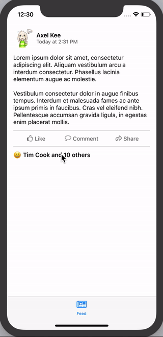
Build and run the app now, and drag the card view, you will the console log as follows :
When user drag upward, the translation.y will be negative value, and when user drag downward, the translation.y will be positive value. We will add this translation.y value to the top constraint value of the card view to move it.
There's three state of panGestureRecognizer, .began, .changed and .end .
.began is right before we drag the view with finger (we just place finger on screen, haven't move yet).
.changed is when we are moving our finger on screen (dragging).
.end is when we finish drag and lift our finger away from screen.
In .began state, we store the current card view's top constraint constant value into the variable cardPanStartingTopConstant :
cardPanStartingTopConstant = cardViewTopConstraint.constant
This is so that in the .changed state, we can update the card view top constraint value by adding the distance dragged (translation.y) :
self.cardViewTopConstraint.constant = self.cardPanStartingTopConstant + translation.y
And we don't want the user to be able to drag the card view lesser than 30pt (< 30 pt) away from Safe Area top :
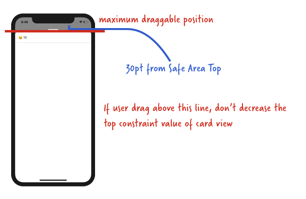
Converting these into code :
// if the current drag distance + starting drag position is larger than 30 pt
if self.cardPanStartingTopConstant + translation.y > 30.0 {
  // then only move the card
  self.cardViewTopConstraint.constant = self.cardPanStartingTopConstant.constant + translation.y
}
And putting them together into the viewPanned() function :
@IBAction func viewPanned(_ panRecognizer: UIPanGestureRecognizer) {
  // how much has user dragged
  let translation = panRecognizer.translation(in: self.view)

  switch panRecognizer.state {
  case .began:
    cardPanStartingTopConstant = cardViewTopConstraint.constant
  case .changed :
    if self.cardPanStartingTopConstant + translation.y > 30.0 {
        self.cardViewTopConstraint.constant = self.cardPanStartingTopConstant + translation.y
    }
  case .ended :
    print("drag ended")
    // we will do other stuff here later on
  default:
    break
  }
}
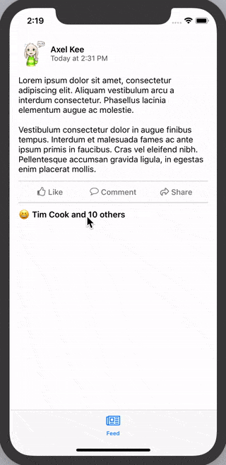
Now build and run the project, we should be able to drag the card view around now :
Looking good! But somehow something feels off, in the Facebook / Slack app, when we release the card view, it will snap to a certain position. Our current implementation doesn't have the "snap to" effect hence it feels a bit sloppy, we are going to add the "snap-to effect" next.
Adding a snap-to effect
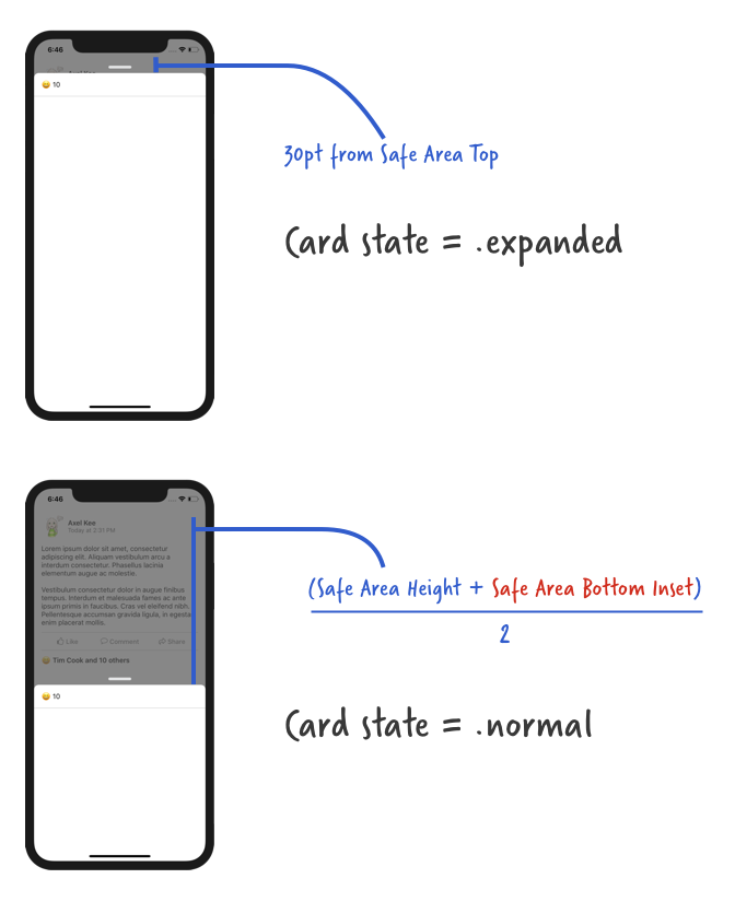
As the card has two state, .normal and .expanded , we want the card to snap to different state (and size) depending on the height of the card when user stop dragging.
Here's a diagram of what card state to snap to when user release the drag :
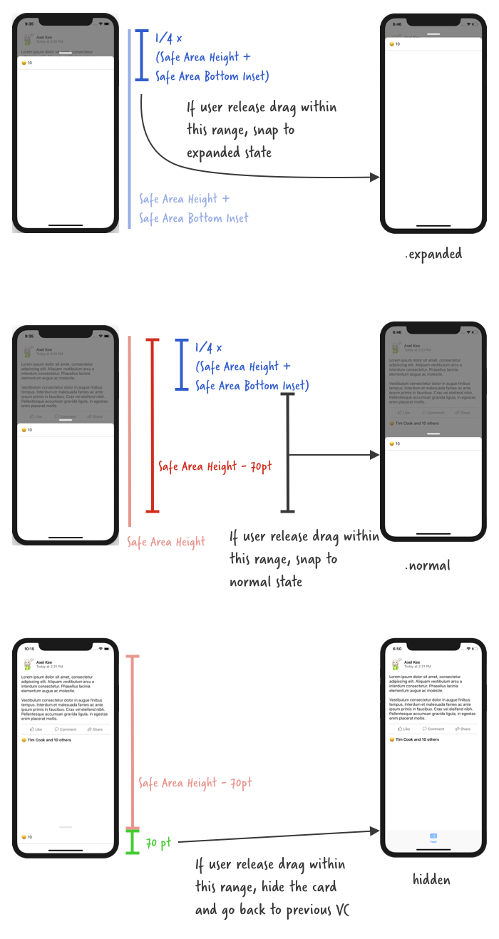
When user release drag, the pan recognizer state is .ended . We can translate the above diagram into code like this :
@IBAction func viewPanned(_ panRecognizer: UIPanGestureRecognizer) {
  // how much has user dragged
  let translation = panRecognizer.translation(in: self.view)

  switch panRecognizer.state {
  case .began:
    cardPanStartingTopConstant = cardViewTopConstraint.constant
  case .changed :
    if self.cardPanStartingTopConstant + translation.y > 30.0 {
        self.cardViewTopConstraint.constant = self.cardPanStartingTopConstant + translation.y
    }
  case .ended :
    if let safeAreaHeight = UIApplication.shared.keyWindow?.safeAreaLayoutGuide.layoutFrame.size.height,
      let bottomPadding = UIApplication.shared.keyWindow?.safeAreaInsets.bottom {

      if self.cardViewTopConstraint.constant < (safeAreaHeight + bottomPadding) * 0.25 {
        // show the card at expanded state
        // we will modify showCard() function later
      } else if self.cardViewTopConstraint.constant < (safeAreaHeight) - 70 {
        // show the card at normal state
        showCard()
      } else {
        // hide the card and dismiss current view controller
        hideCardAndGoBack()
      }
    }
  default:
    break
  }
}
Build and run the app, you should see that the card view will snap to "normal" state position or hide underneath when you release the drag, we're almost there! 🙌
Currently, our showCard() function will only animate the card to the middle position (.normal state). We can create another function to animate the card to the top position (.expanded state), but it would be a waste to not reuse the showCard() function as most of the animation code are same except for the card view top constraint value.
Let's edit the showCard() function, update the function name to accept a parameter atState: CardState, so that it will animate to the specified card state (.normal or .expanded).
// default to show card at normal state, if showCard() is called without parameter
private func showCard(atState: CardViewState = .normal) {

  // ensure there's no pending layout changes before animation runs
  self.view.layoutIfNeeded()

  // set the new top constraint value for card view
  // card view won't move up just yet, we need to call layoutIfNeeded()
  // to tell the app to refresh the frame/position of card view
  if let safeAreaHeight = UIApplication.shared.keyWindow?.safeAreaLayoutGuide.layoutFrame.size.height,
    let bottomPadding = UIApplication.shared.keyWindow?.safeAreaInsets.bottom {

    if atState == .expanded {
      // if state is expanded, top constraint is 30pt away from safe area top
      cardViewTopConstraint.constant = 30.0
    } else {
      cardViewTopConstraint.constant = (safeAreaHeight + bottomPadding) / 2.0
    }

    cardPanStartingTopConstraint = cardViewTopConstraint.constant
  }

  // move card up from bottom
  // create a new property animator
  let showCard = UIViewPropertyAnimator(duration: 0.25, curve: .easeIn, animations: {
    self.view.layoutIfNeeded()
  })

  // show dimmer view
  // this will animate the dimmerView alpha together with the card move up animation
  showCard.addAnimations {
    self.dimmerView.alpha = 0.7
  }

  // run the animation
  showCard.startAnimation()
}
Then we can now plug the modified showCard(atState: .expanded) to the viewPanned() function to snap to expanded state :
@IBAction func viewPanned(_ panRecognizer: UIPanGestureRecognizer) {
  // how much has user dragged
  let translation = panRecognizer.translation(in: self.view)

  switch panRecognizer.state {
  case .began:
    cardPanStartingTopConstant = cardViewTopConstraint.constant
  case .changed :
    if self.cardPanStartingTopConstant + translation.y > 30.0 {
        self.cardViewTopConstraint.constant = self.cardPanStartingTopConstraint + translation.y
    }
  case .ended :
    if let safeAreaHeight = UIApplication.shared.keyWindow?.safeAreaLayoutGuide.layoutFrame.size.height,
      let bottomPadding = UIApplication.shared.keyWindow?.safeAreaInsets.bottom {

      if self.cardViewTopConstraint.constant < (safeAreaHeight + bottomPadding) * 0.25 {
        // show the card at expanded state
        showCard(atState: .expanded)
      } else if self.cardViewTopConstraint.constant < (safeAreaHeight) - 70 {
        // show the card at normal state
        showCard(atState: .normal)
      } else {
        // hide the card and dismiss current view controller
        hideCardAndGoBack()
      }
    }
  default:
    break
  }
}
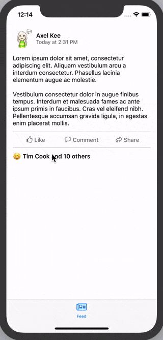
Build and run the app, now when you release the drag near the top, the card will animate to the expanded state! 🙌
Wait, there's one more thing! There's still one functionality to be implemented for the dragging. 😂
If you have noticed, when you open the Reaction List card view from Facebook app, you can dismiss it by dragging it down to bottom or swipe it down really fast.
So far we only implemented the dismiss (hideCardAndGoBack() ) when user drag the card view to the bottom, now we are going to implement the dismiss when user swipe it down really fast.
Swipe down to dismiss card view
To detect if user is dragging / swiping down really fast, we can use the velocity property from the pan gesture recognizer to check the speed of dragging :
panRecognizer.velocity(in: self.view)
Similar to the translation property, if user drag upwards, the velocity will be in negative value, and if user drag downwards, the velocity will be in positive value. The faster the user drag it, the bigger the velocity is.
You can use a print statement to record down the velocity of drag / swipe speed. I have experimented a bit and found the threshold for the speed of swiping down quickly is around 1500.
Putting it in code, the viewPanned function's .ended state :
@IBAction func viewPanned(_ panRecognizer: UIPanGestureRecognizer) {
  // how much has user dragged
  let translation = panRecognizer.translation(in: self.view)

  // how fast the user drag
  let velocity = panRecognizer.velocity(in: self.view)

  switch panRecognizer.state {
  case .began:
    cardPanStartingTopConstraint = cardViewTopConstraint.constant
  case .changed :
    if self.cardPanStartingTopConstant + translation.y > 30.0 {
      self.cardViewTopConstraint.constant = self.cardPanStartingTopConstant + translation.y
    }
  case .ended :
    // if user drag down with a very fast speed (ie. swipe)
    if velocity.y > 1500.0 {
      // hide the card and dismiss current view controller
      hideCardAndGoBack()
      return
    }

    if let safeAreaHeight = UIApplication.shared.keyWindow?.safeAreaLayoutGuide.layoutFrame.size.height,
      let bottomPadding = UIApplication.shared.keyWindow?.safeAreaInsets.bottom {

      if self.cardViewTopConstraint.constant < (safeAreaHeight + bottomPadding) * 0.25 {
        // show the card at expanded state
        showCard(atState: .expanded)
      } else if self.cardViewTopConstraint.constant < (safeAreaHeight) - 70 {
        // show the card at normal state
        showCard()
      } else {
        // hide the card and dismiss current view controller
        hideCardAndGoBack()
      }
    }
  default:
    break
  }
}
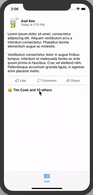
And now we can swipe down quickly to dismiss the card view :
Looking good! You could call this a day if you wanted to, but there's still a thing (okay I promise this is the last one) to nitpick of. When we drag on the card view, the alpha of the dimmer view should change depending on how far have we dragged the card view. The background should be darker when we drag upwards, and lighter when we drag downwards.
Dimmer view alpha manipulation
Here's an example on Facebook card view, notice the background gets darker when we drag upward, but it doesn't get any more darker after the card reached the normal state distance :

Notice that the background doesn't get darker if we drag the card upwards from its normal state to expanded state. The alpha of the dimmer view only change when the card is between normal state and hidden (bottom of visible area).
Here's an explanation on how the alpha of dimmer view changes :
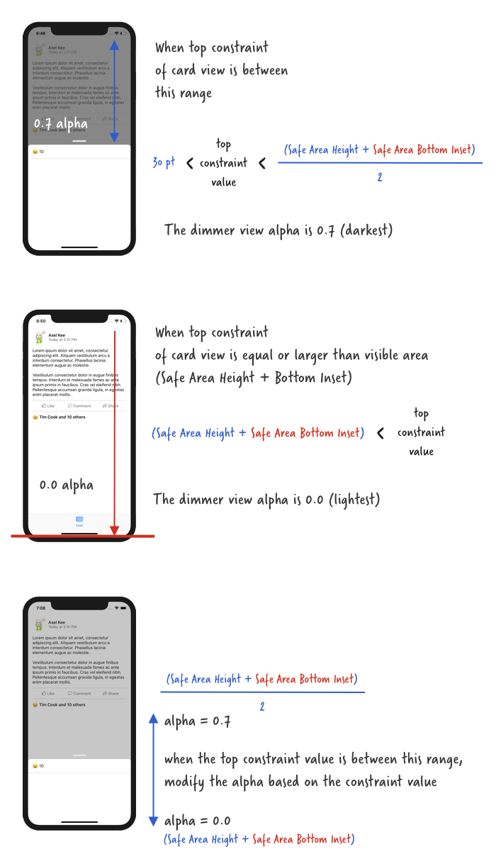
We can write a function that accepts a parameter, which is the current top constraint value of the card view, and use this parameter to calculate and return the alpha of the dimmer view.
Let's call this function **dimAlphaWithCardTopConstraint(value: CGFloat) ** :
// ReactionViewController.swift

private func dimAlphaWithCardTopConstraint(value: CGFloat) -> CGFloat {
  let fullDimAlpha : CGFloat = 0.7

  // ensure safe area height and safe area bottom padding is not nil
  guard let safeAreaHeight = UIApplication.shared.keyWindow?.safeAreaLayoutGuide.layoutFrame.size.height,
    let bottomPadding = UIApplication.shared.keyWindow?.safeAreaInsets.bottom else {
    return fullDimAlpha
  }

  // when card view top constraint value is equal to this,
  // the dimmer view alpha is dimmest (0.7)
  let fullDimPosition = (safeAreaHeight + bottomPadding) / 2.0

  // when card view top constraint value is equal to this,
  // the dimmer view alpha is lightest (0.0)
  let noDimPosition = safeAreaHeight + bottomPadding

  // if card view top constraint is lesser than fullDimPosition
  // it is dimmest
  if value < fullDimPosition {
    return fullDimAlpha
  }

  // if card view top constraint is more than noDimPosition
  // it is dimmest
  if value > noDimPosition {
    return 0.0
  }

  // else return an alpha value in between 0.0 and 0.7 based on the top constraint value
  return fullDimAlpha * 1 - ((value - fullDimPosition) / fullDimPosition)
}
Then we can use this function in the viewPanned() function's .changed state like this :
@IBAction func viewPanned(_ panRecognizer: UIPanGestureRecognizer) {
  let velocity = panRecognizer.velocity(in: self.view)
  let translation = panRecognizer.translation(in: self.view)

  switch panRecognizer.state {
  case .began:
    cardPanStartingTopConstant = cardViewTopConstraint.constant

  case .changed:
    if self.cardPanStartingTopConstraint + translation.y > 30.0 {
      self.cardViewTopConstraint.constant = self.cardPanStartingTopConstant + translation.y
    }

    // change the dimmer view alpha based on how much user has dragged
    dimmerView.alpha = dimAlphaWithCardTopConstraint(value: self.cardViewTopConstraint.constant)

  case .ended:
    if velocity.y > 1500.0 {
      hideCardAndGoBack()
      return
    }

    if let safeAreaHeight = UIApplication.shared.keyWindow?.safeAreaLayoutGuide.layoutFrame.size.height,
      let bottomPadding = UIApplication.shared.keyWindow?.safeAreaInsets.bottom {

      if self.cardViewTopConstraint.constant < (safeAreaHeight + bottomPadding) * 0.25 {
        showCard(atState: .expanded)
      } else if self.cardViewTopConstraint.constant < (safeAreaHeight) - 70 {
        showCard(atState: .normal)
      } else {
        hideCardAndGoBack()
      }
    }
  default:
    break
  }
}
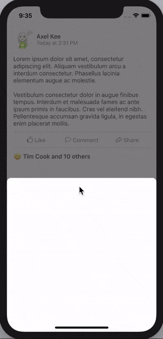
Build and run the app, drag the card view and see the dimmer alpha changes! 🤘
Congratulations! You have managed to implement a draggable card modal view without using any library 😆🙌. (Remember, Cocoa developer, not Cocoapod developer, jk 😂)
The next step is optional but I think it would make a better experience of the user by placing a "handle" view as an indicator that the card view is draggable.
Adding handle view
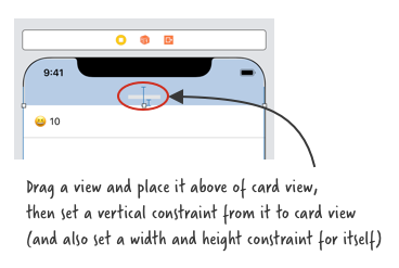
Adding a handle view is quite straightforward. Open storyboard, drag a view and place it above the card view, set a gray background color for it, then set a width / height constraint for itself, horizontal to superview constraint, and a vertical spacing constraint to the card view.
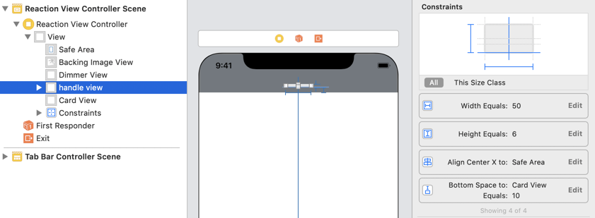
Next, we are going to round its corner. To do this, create an IBOutlet (I named it as handleView) for the handle view, and round it in viewDidLoad.
// round the handle view
handleView.clipsToBounds = true
handleView.layer.cornerRadius = 3.0
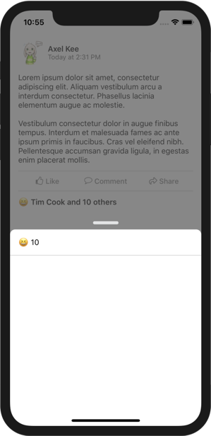
I have added UILabel and another separator view into the card view, you can add any additional content you want inside the card view.
The end result looks like this :
In a hurry or dont want to spend a lot of time implementing the steps? Dive in the completed project and try it out yourself!
Get the completed project ($)