Making Sense of Auto Layout Series
Chapter 1 / Chapter 2 / Chapter 3 / Chapter 4 / Chapter 5 / Chapter 6
This is the second part of Making Sense of Auto Layout Series.
Previously, we have explained the difference between frame based layout and Auto layout with constraint. In this post we will take a closer look on how Auto Layout calculates and position view.
For easier understanding, assume there is an Auto Layout Engine that takes input of constraints (the constraint you created in Xcode) and app screen size (depending on iOS device screen resolution, orientation).
Here is the official screen resolution of each iOS devices, for UI development we will use the UIKit Size (Points) column.
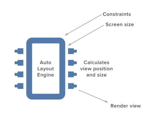
In order for Auto Layout to render the position and size of a view correctly, Auto Layout engine must know or able to calculate the :
- x position of a view
- y position of a view
- width of a view
- height of a view
Defining constraint helps Auto Layout Engine to figure all of the above. Below I will show few examples of how Auto Layout calculate the position and size of a view using simple math (~grade school math).
We will discuss 4 examples and 1 exercise question in this post.
Example 1
A straight forward example might look like this :
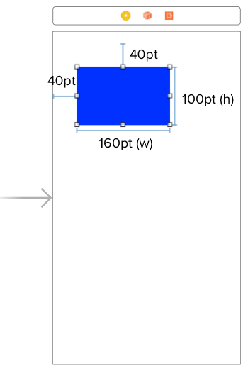
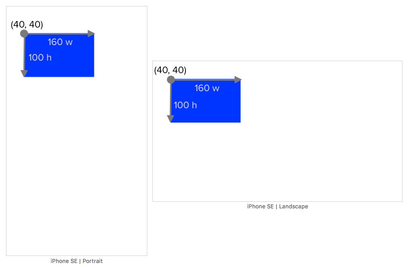
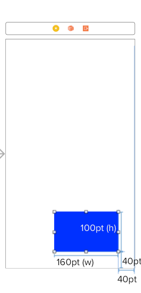
4 constraints are defined :
- Distance from the screen left to the left of the blue view is 40 pt
- Distance from the screen top to the top of the blue view is 40 pt
- Width of the blue view is 160 pt
- Height of the blue view is 100 pt
From the 1st constraint, we can deduce that the x position of the view is 40.
From the 2nd constraint, we can deduce that the y position of the view is 40.
Since x, y, width and height of the view is known, Auto Layout Engine will render it nicely across multiple screen size and orientation :
Example 2
Similar to previous example, we use back the same width and height but this time we define a right and bottom constraint like this :
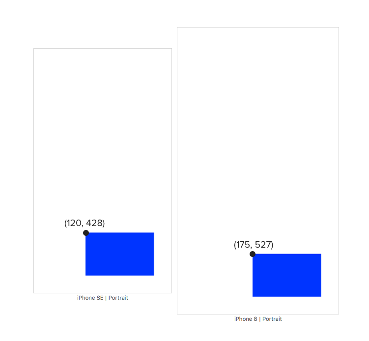
4 constraints are defined :
- Distance from the screen right to the right of the blue view is 40 pt
- Distance from the screen bottom to the bottom of the blue view is 40 pt
- Width of the blue view is 160 pt
- Height of the blue view is 100 pt
To calculate x position of the blue view, Auto Layout Engine will use the screen width. Calculation on an iPhone SE (screen width 320 pt) will look like this :
screenWidth = 320
distanceFromRight = 40
viewWidth = 160

// x position of the blue view
x = screenWidth - distanceFromRight - viewWidth
x = 320 - 40 - 160
x = 120
To calculate y position of the blue view, Auto Layout Engine will use the screen height. Calculation on an iPhone SE (screen height 568 pt) will look like this :
screenHeight = 568
distanceFromBottom = 40
viewHeight = 100

// y position of the blue view
y = screenHeight - distanceFromBottom - viewHeight
y = 568 - 40 - 100
y = 428
Using the same calculation formula, iPhone 8 (screen width 375, height 667) will calculate the x position as 175, y postion as 527.
Now x, y, width and height of the view is known, Auto Layout Engine will render it nicely across multiple screen size and orientation :
Example 3
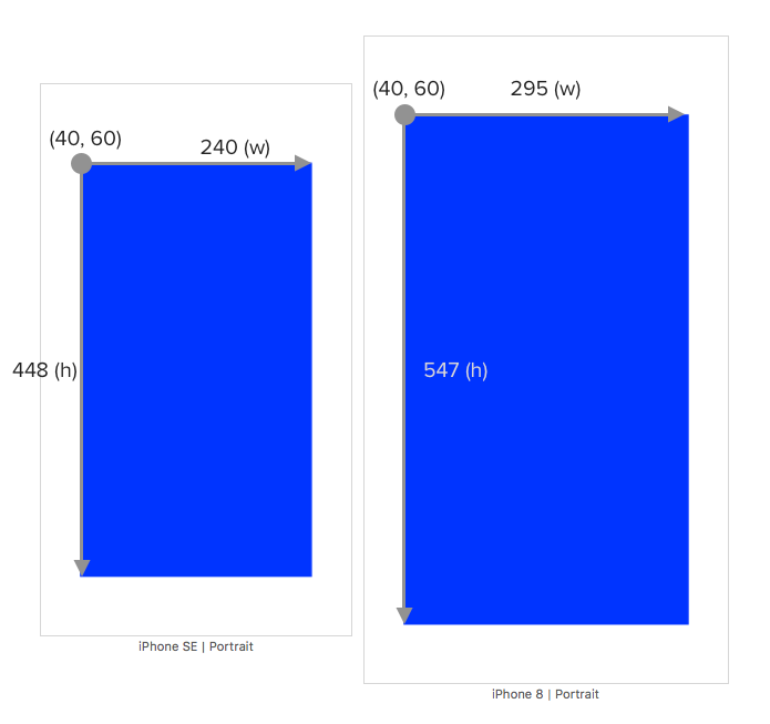
In this example, there is no width or height constraint defined, instead we will set the top, left, right and bottom constraint from the blue view to the screen :
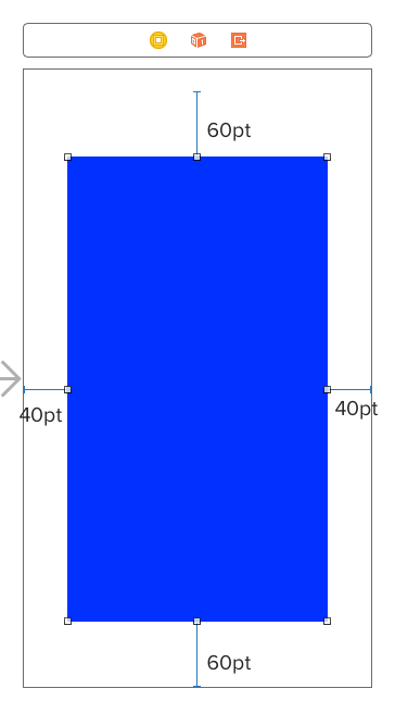
4 constraints are defined :
- Distance from the screen top to the top of the blue view is 60 pt
- Distance from the screen left to the left of the blue view is 40 pt
- Distance from the screen right to the right of the blue view is 40 pt
- Distance from the screen bottom to the bottom of the blue view is 60 pt
From the 1st constraint, we can deduce that the y position of the view is 60.
From the 2nd constraint, we can deduce that the x position of the view is 40.
To calculate width of the blue view, Auto Layout Engine will use the screen width. Calculation on an iPhone SE (screen width 320 pt) will look like this :
screenWidth = 320
distanceFromLeft = 40
distanceFromRight = 40

// width of the blue view
viewWidth = screenWidth - distanceFromLeft - distanceFromRight
viewWidth = 320 - 40 - 40
viewWidth = 240
To calculate height of the blue view, Auto Layout Engine will use the screen height. Calculation on an iPhone SE (screen height 568 pt) will look like this :
screenHeight = 568
distanceFromTop = 60
distanceFromBottom = 60

// height of the blue view
viewHeight = screenHeight - distanceFromTop - distanceFromBottom
viewHeight = 568 - 60 - 60
viewHeight = 448
Using the same calculation formula, iPhone 8 (screen width 375, height 667) will calculate the width as 295, height as 547.
Now x, y, width and height of the view is known, Auto Layout Engine will render it nicely across multiple screen size and orientation :
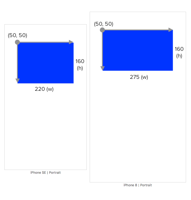
Example 4
This example will be a bit more difficult to calculate than previous ones, the constraints are defined like this :
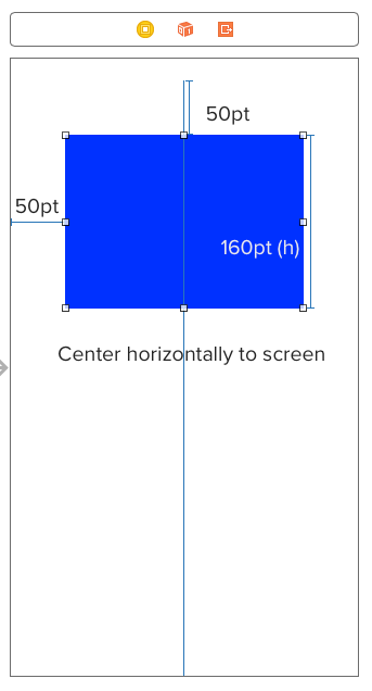
4 constraints are defined :
- Distance from the screen top to the top of the blue view is 50 pt
- Distance from the screen left to the left of the blue view is 50 pt
- Height of the blue view is 160 pt
- Blue view is horizontally centered to the screen
From the 1st constraint, we can deduce that the y position of the view is 50.
From the 2nd constraint, we can deduce that the x position of the view is 50.
The remaining step is to calculate the width of the blue view since height is given. Since blue view is horizontally centered, it means that the left half of the width is same as the right half, like this :
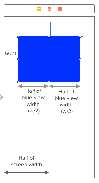
From the above diagram, we can deduce that :
50 + half of blue view width = half of screen width
To calculate width of the blue view, Auto Layout Engine will use the screen width. Calculation on an iPhone SE (screen width 320 pt) will look like this :
screenWidth = 320
distanceFromLeft = 50

distanceFromLeft + (viewWidth / 2 ) = screenWidth / 2
50 + (viewWidth / 2) = 320 / 2
50 + (viewWidth / 2) = 160
viewWidth / 2 = 160 - 50
viewWidth / 2 = 110
viewWidth = 110 * 2
viewWidth = 220
Using the same calculation formula, iPhone 8 (screen width 375, height 667) will calculate the width as 275.
Now x, y, width and height of the view is known, Auto Layout Engine will render it nicely across multiple screen size and orientation :
This example is useful for cases where you want to center a view with equal left spacing and right spacing. Instead of setting left space constraint and right space constraint manually to the same number, you can just set the left space constraint and set a horizontally center constraint on the view.
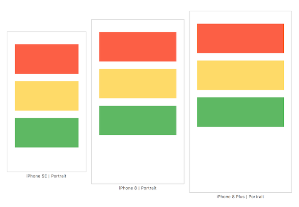
Homework exercise - Multiple View
We have discussed various examples and now its time to do some hands on calculation 📝! Although previous examples only use one view, the same concept and calculation still applies for multiple view.
Here is the exercise question :
Calculate the x position, y position, width and height of red, yellow and green view. Assuming iPhone SE screen size is used (320pt x 568 pt)
The constraints are defined as follow :
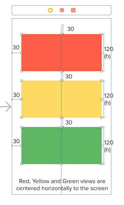
- Distance from the screen top to the top of red view is 30 pt
- Distance from the screen left to the left of red view is 30 pt
- Height of red view is 120 pt
- Distance from bottom of red view to top of yellow view is 30 pt
- Distance from the screen left to the left of yellow view is 30 pt
- Height of yellow view is 120 pt
- Distance from bottom of yellow view to top of green view is 30 pt
- Distance from the screen left to the left of green view is 30 pt
- Height of green view is 120 pt
- Red view is horizontally centered on the screen
- Yellow view is horizontally centered on the screen
- Green view is horizontally centered on the screen
The answer will be at the end of this post, be sure to try it before looking at the answer! 🤔
Hint : Start calculating from the view at the top first then proceed to bottom.
Summary
The takeaway of this post is that if Auto Layout Engine can calculate all of the views position and size using the given constraints, it will render them nicely. If there is not enough constraint, Auto Layout Engine can't calculate position/size of some view, it will attempt to 'guess' their position/size and thats the reason why you see some layout going haywire when constraints are not defined correctly.
Here is the checklist to ensure Auto Layout Engine can render the view correctly.
Does the constraints defined allow Auto Layout Engine to know / calculate :
- x position of all view ✅
- y position of all view ✅
- width of all view ✅
- height of all view ✅
One quick way to determine if Auto Layout Engine is able to calculate them (position and size) is to calculate it yourself, by using pen and paper. If you can't deduce them using math, Auto Layout Engine can't either. Once you get a hang of it, you won't need to calculate these by hand, as long as you know how to define constraints that enable Auto Layout Engine to calculate these, your layout will look great on every device.
In the next post, we will look into how to solve missing constraint (when Xcode show you red lines around your view.)
“dude… wow… good job on this Auto Layout book! One of the best explanations I’ve read!” – Alex Kluew
Exercise Answer
On iPhone SE screen :
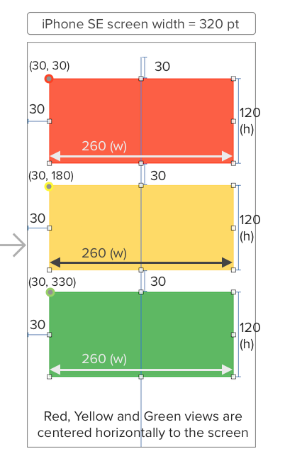
Red View :
- X position is 30
- Y position is 30
- Width is 260
- Height is 120
Yellow View :
- X position is 30
- Y position is 180
- Width is 260
- Height is 120
Green View :
- X position is 30
- Y position is 330
- Width is 260
- Height is 120
This is how it looks like in multiple screen sizes :